Problem
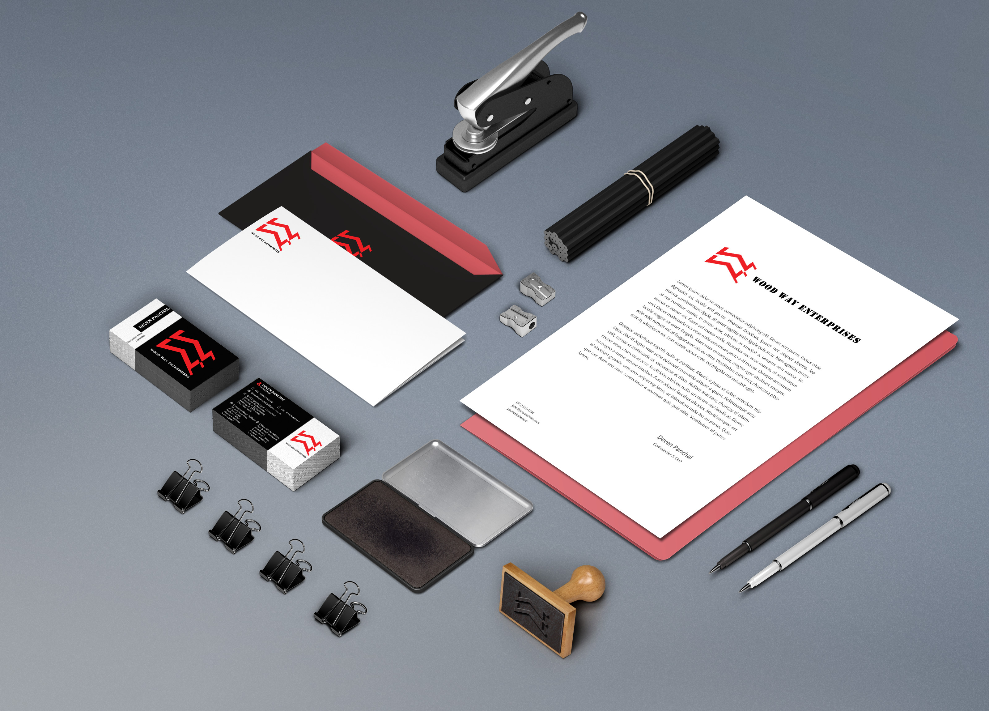
Wood Way Enterprises (WWE) is a civil work and interior designing business independently run by a proprietor. I have closely worked with the WWE team for enriching it's brand identity. As a part of this project, I have designed the WWE logo, business card and multiple stationary for them.
Type Individual My Role Designer, Researcher Timeline June 2015 (2 weeks) Tools Used Photoshop, Illustrator
What I learned
Card Design
Logo Design
Branding
Logo Design
Handcrafted.
It was a nice challenge to design this logo since I had to comprise a fairly long company name (Wood Way Enterprises) into the logo. After a lot of brainstorming and designs this was finally approved by the client.
Card Design
Card Front.
To understand how people share and read business card, I observed 50 card sharing instances for 5 persons in total (10 instances each). I noticed that the card was shared either by holding the card from the top-right corner (right-handed person) or the top-left corner (left-handed person). Since my client was left handed I decided to put his name and designation vertically from left so that whenever he hands over the card, the receiving person can quickly glance through the name and dasignation. The logo and company name has been designed in a standard fashion.
Card back.
Ideally the back of the card should have a clean design only with important content, however, this client of mine had a lot to put in. It was tough on finalising the design for the back side of the card since more content made it clumsy. After all the iterations, this was the final design for the back of the card.
Branding